Design Narrative for XOXO by Jaime
XOXO by Jaime is not just a made up brand; it's my personal story to the power of connection through art. Each piece of stationery and every piece I create is infused with a story—my story. As an artist, I believe that the true value of art lies not just in its beauty, but in its ability to evoke emotions, connect individuals, and create lasting memories. With "XOXO by Jaime," I aim to transform everyday materials into extraordinary pieces of communication that carry more than just words—they carry feelings.
Why the Brand and Myself:
Branding "XOXO by Jaime" under my personal name is a commitment to authenticity and personal touch in every product. This brand is deeply rooted in personal artistic expression, and I chose to place my name at the forefront to highlight the handcrafted nature of the work and the personal accountability I bring to my art. My designs are a reflection of my journey, passions, and the intimate connection I share with my audience. By choosing to brand this endeavor as "XOXO by Jaime," I'm inviting customers into my world, where every item tells a part of my story.
Rigid Box Structure:
The choice of a rigid box structure for the packaging was deliberate and meaningful. In the world of stationery and party supplies, the first interaction a customer has with a product is often through its packaging. A rigid box speaks volumes about the quality and care put into the product inside. It's durable, elegant, and inherently valuable—mirroring the attributes of the items it encases. This packaging choice reflects my commitment to quality and sustainability, ensuring that the art isn't just in the product, but in every aspect of the customer's experience.
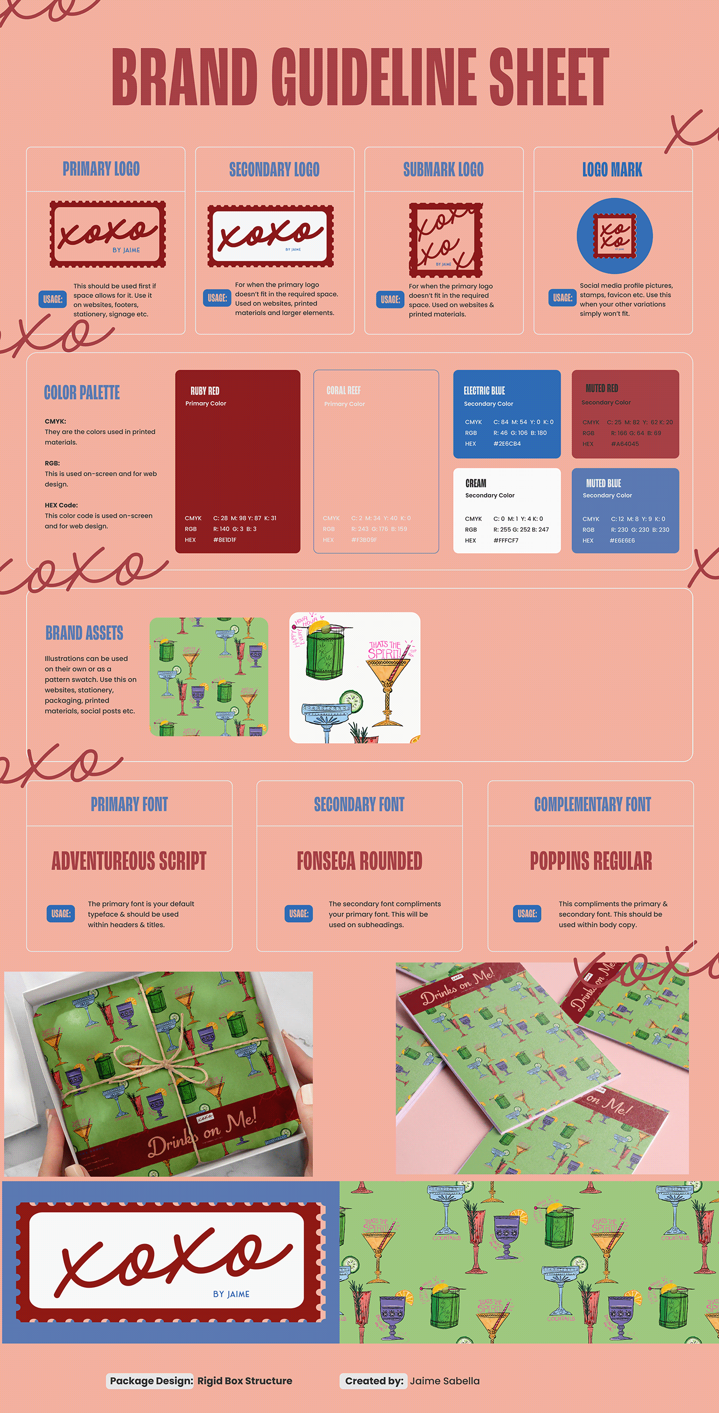
Design Choices:
The design elements of "XOXO by Jaime" are carefully chosen to represent the dual themes of warmth and professionalism. The colors—red for passion and energy, light muted red for softness and approachability, and blue for trust and depth—form a palette that resonates with a wide audience while maintaining a unique identity. The script font used in the logo and other branding elements is not just about aesthetics; it signifies the personal, handwritten touch that goes into the creation of each product. The logo, mimicking a postage stamp, symbolizes the brand's focus on communication and the sending of messages, both literal and emotional. As I started my business with just postcards.
Through "XOXO by Jaime," I aim to not just sell products, but to create an experience that enhances the moments of life—be they daily communications or special celebrations. The rigid box packaging is a cornerstone of this experience, ensuring that from the moment a customer receives their product, they feel the value, care, and personal connection that define my brand. This was more than a project, it was the start of a brand.